Aa Bb Cc 0123
Headlines, hero copy, eyebrow labels, page titles inside the operator product.
Colors, typography, logos, icons, and design tokens that show up on every SnagATime surface — from the public directory to the operator product. Designers, partners, and engineers should treat this page as canonical.
Every color used across SnagATime is named here. Click a swatch to copy its hex.
Three typefaces, served from Google Fonts. Display sets the brand voice; body carries every block of running text; mono shows quantitative or token content.
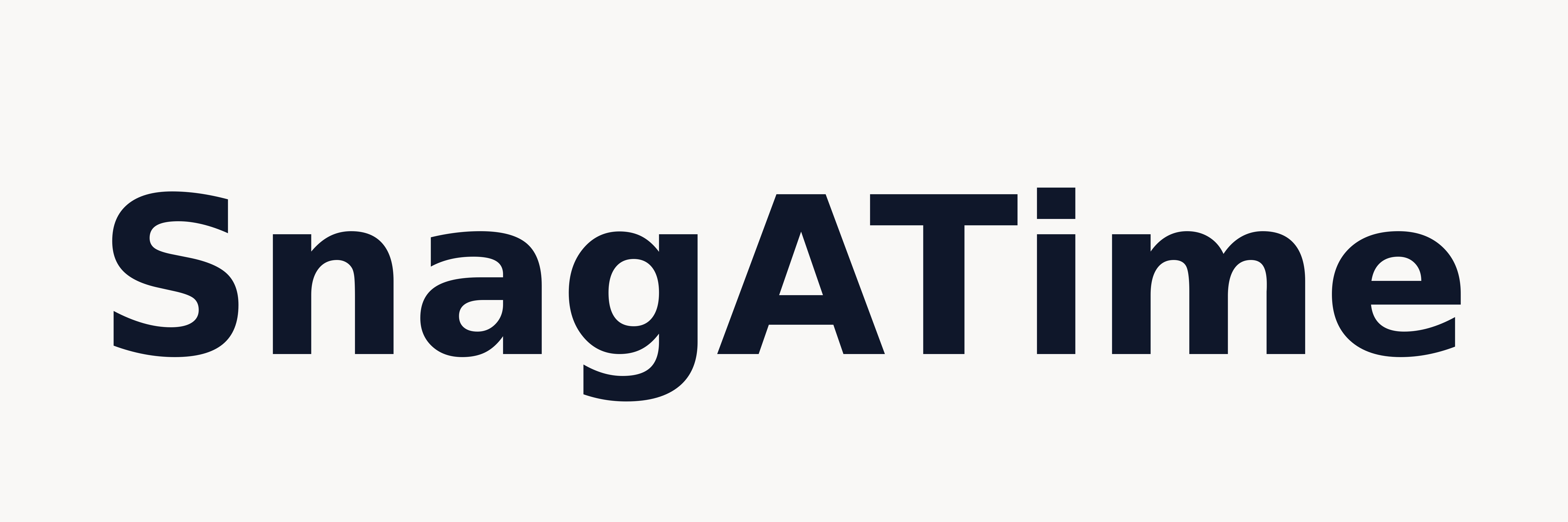
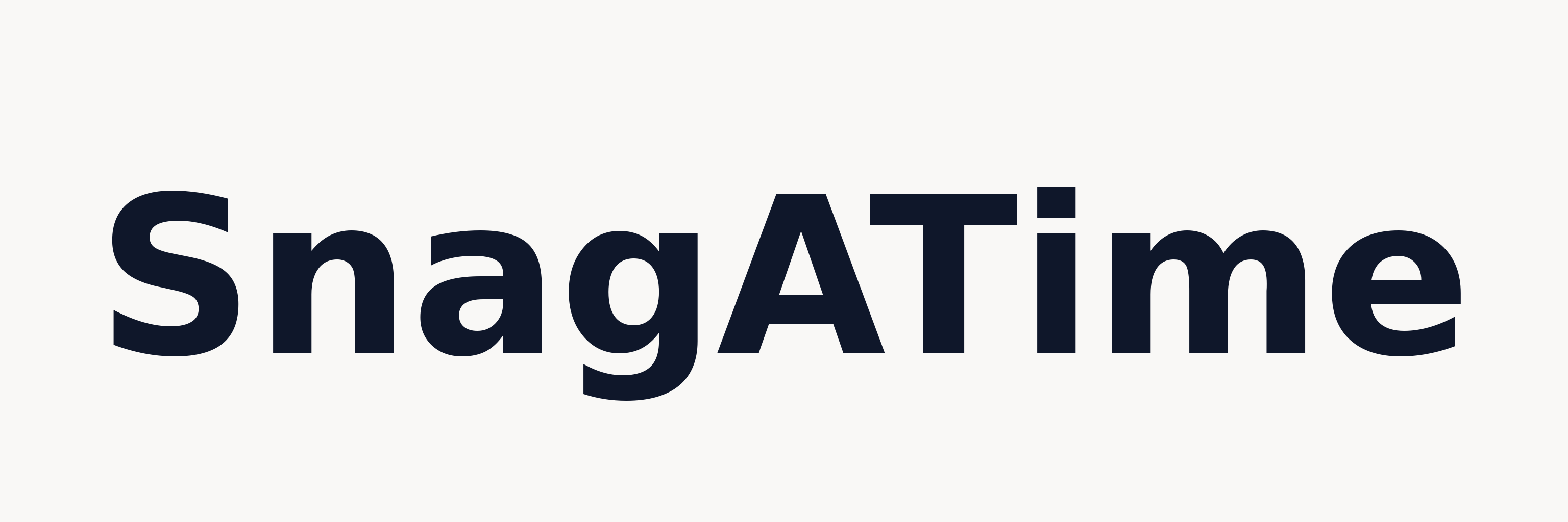
Headlines, hero copy, eyebrow labels, page titles inside the operator product.
All running prose, form labels, table content, navigation. Default for paragraphs.
Numeric KPIs, token names, code, anything that should read as quantitative.
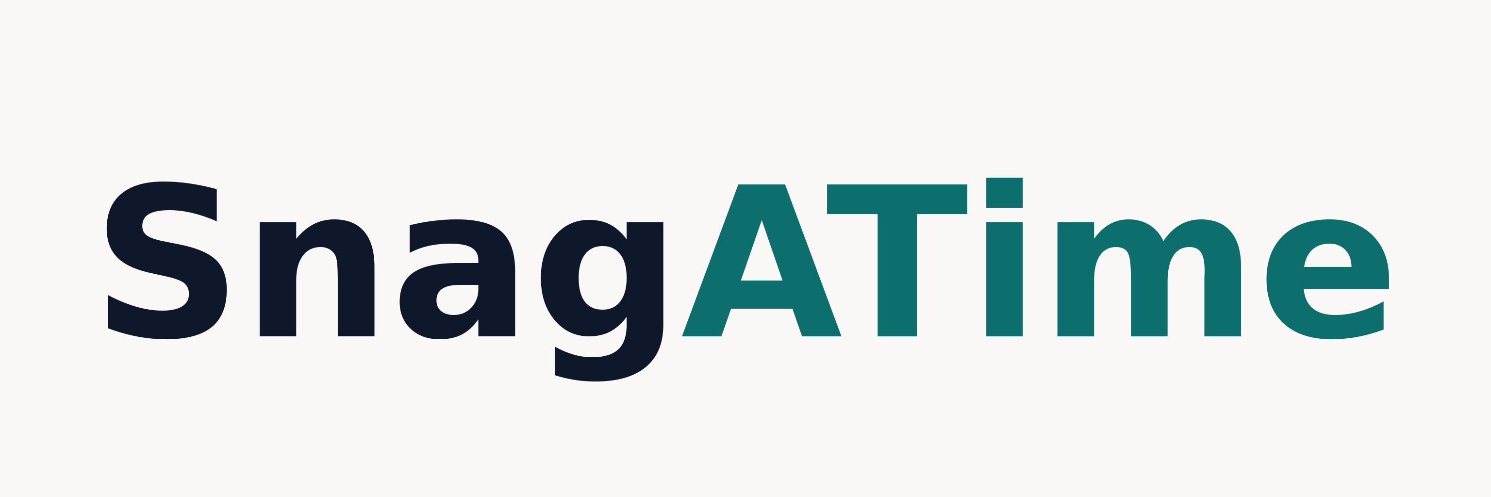
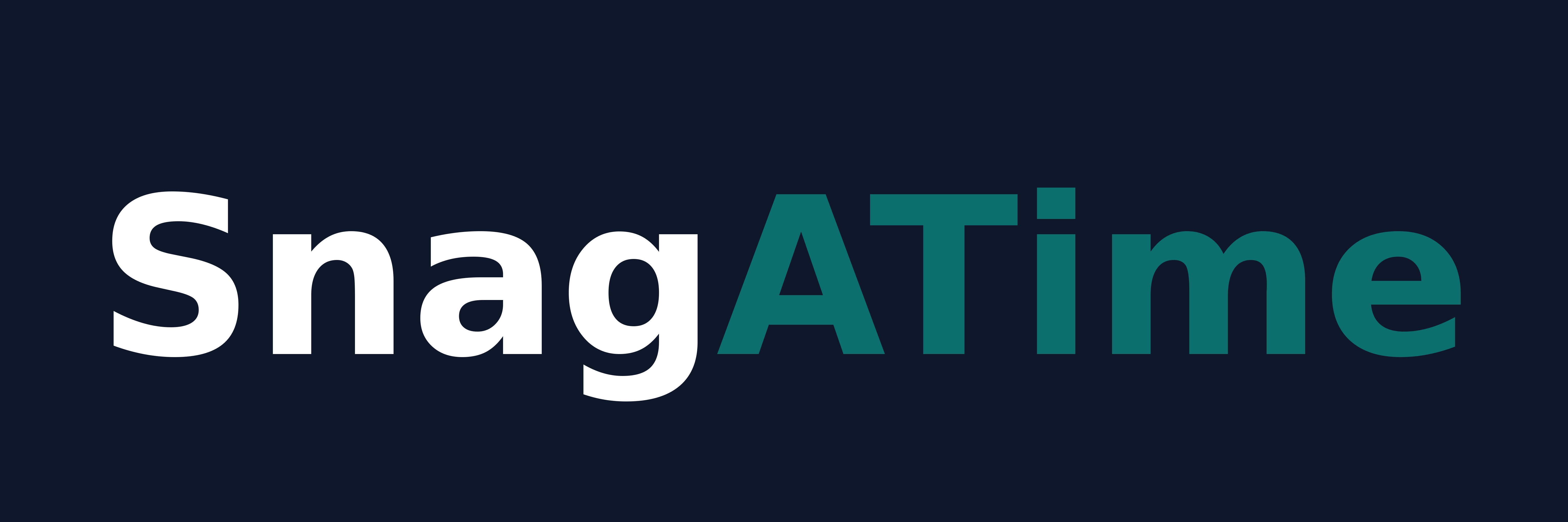
Four official lockups. Pick the variant that fits the background; never recolor or stretch.
Two icon variants: the canonical Teal S mark used across the site, and a Gold accent mark reserved for premium contexts.
Geometry primitives that hold the whole system together. Same names in the marketing site and the operator product.
Maximum content width on the marketing site and inside the operator product's main column.
Minimum hit area for any interactive element. Applies to buttons, nav items, swatches, and tile actions.
These sections are being written. Each card describes the scope; if you need any of these answered before this page catches up, message the brand keeper.
Required padding around every logo and icon mark, and the smallest size each can be reproduced (web + print). Will include do-not-cross gridlines and an at-size validation strip.
Recoloring, stretching, rotating, drop-shadowing, overlaying on busy photography, placing on insufficient-contrast backgrounds — visualized as red-X examples next to correct uses.
How SnagATime sounds in product copy, marketing copy, transactional messages, and operator-facing language. Capitalization (SnagATime is one word, exact casing), pronunciation, and the "we run the boring parts" voice.
Direction for lifestyle, venue interior, and product-in-context photography. Will include shot list, lighting notes, and lens guidance for facility owners shooting their own listing imagery.
The outline-SVG icon system used in the operator dashboard (24×24, single-path, currentColor) and on marketing pages. Will document stroke width, corner treatment, and the supply chain for new icons.
When to use the lighter marketing palette vs. the darker product chrome (navy sidebar on the operator dashboard). Decision tree for hybrid surfaces like the operator login page and the claim-listing iframe preview.
Approved foreground/background combinations against WCAG AA contrast. Will include a checked matrix for every brand + neutral pairing and notes on amber-on-white edge cases.
How venues, suppliers, and integration partners may place their mark alongside SnagATime. Lockup proportions, separator treatments, and approval workflow.